Here is a little taste of my process when creating a painting from this last series, and links to specific products for any artists out there. I don’t always think ahead enough to snap photos when I paint, but I did get a few in-progress shots from this last series that I’d love to share. And I have yet to completely render my phone useless by taking pictures with paint all over my hands, so that’s something.
I tried to include the words of the lyrics or poem in at least one layer of the painting. For this one, the lyrics by Patty Griffin that I zeroed in are:
I went up to the mountain
Because you asked me to
Up over the clouds
To where the sky was blue
I could see all around me
Everywhere
I could see all around me
Everywhere
Here you can see lyrics written in brown watersoluble crayon. This is fun to use because the crayon will interact and drip with other layers. I wouldn’t recommend it if you want legible writing or if your surface is really textured.
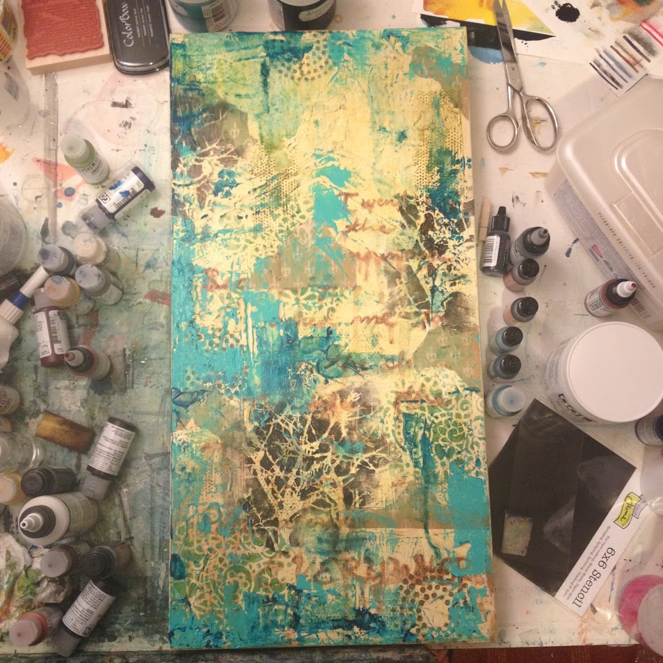
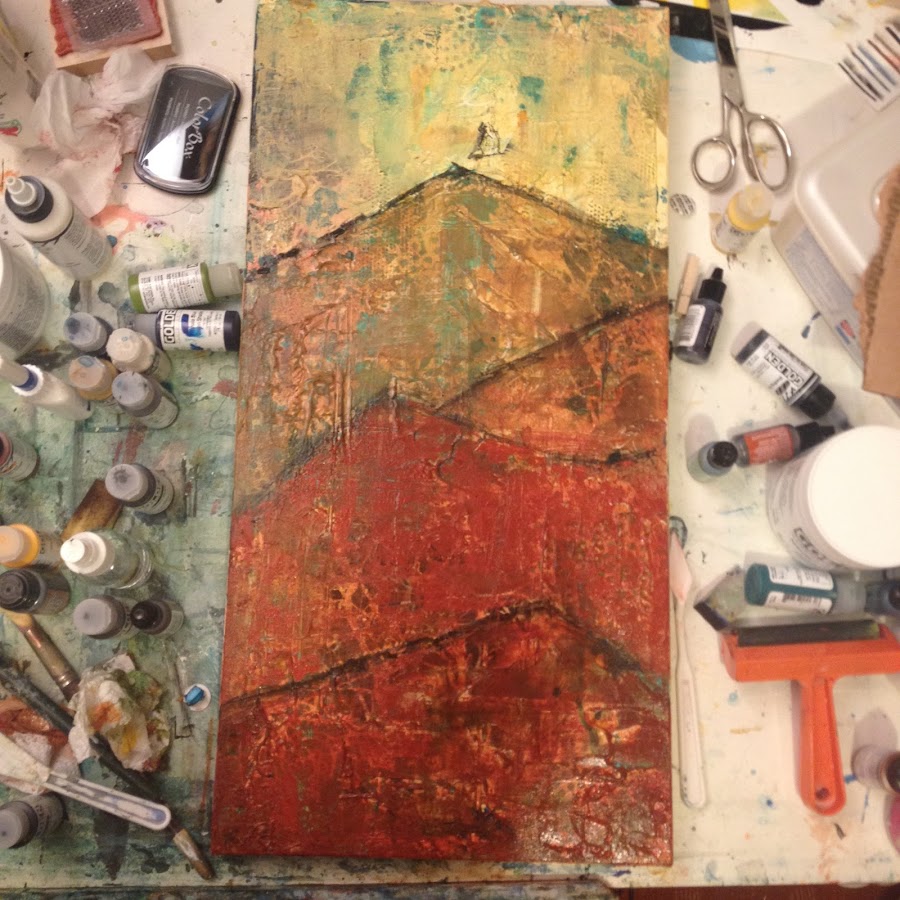
You can see lots of stenciling and stamps, some alcohol inks (I like Tim Holtz Adirondack Inks) and knifed on paint as well as green decorative book end pages from a vintage copy of Robin Hood. You’ll see a lot of Golden Fluid Acrylics littered around my paintings. I’m kind of obsessed with them for glazing and tinting mediums, but they don’t work by themselves for knife work. You’ll want to have some heavier body artists’ acrylic paint on hand for that. I especially love Titan Buff fluid acrylic as a way to lighten other colors but instead of an Easter egg pastel like with Titanium White, you get a warmer, aged look.
Pro tip: if you see the triangular wedge by my orange brayer in the bottom righthand corner–that is a makeup sponge, and it is the BEST tool by a mile for a clean stencil that I’ve found. Better then stencil brushes, etc.
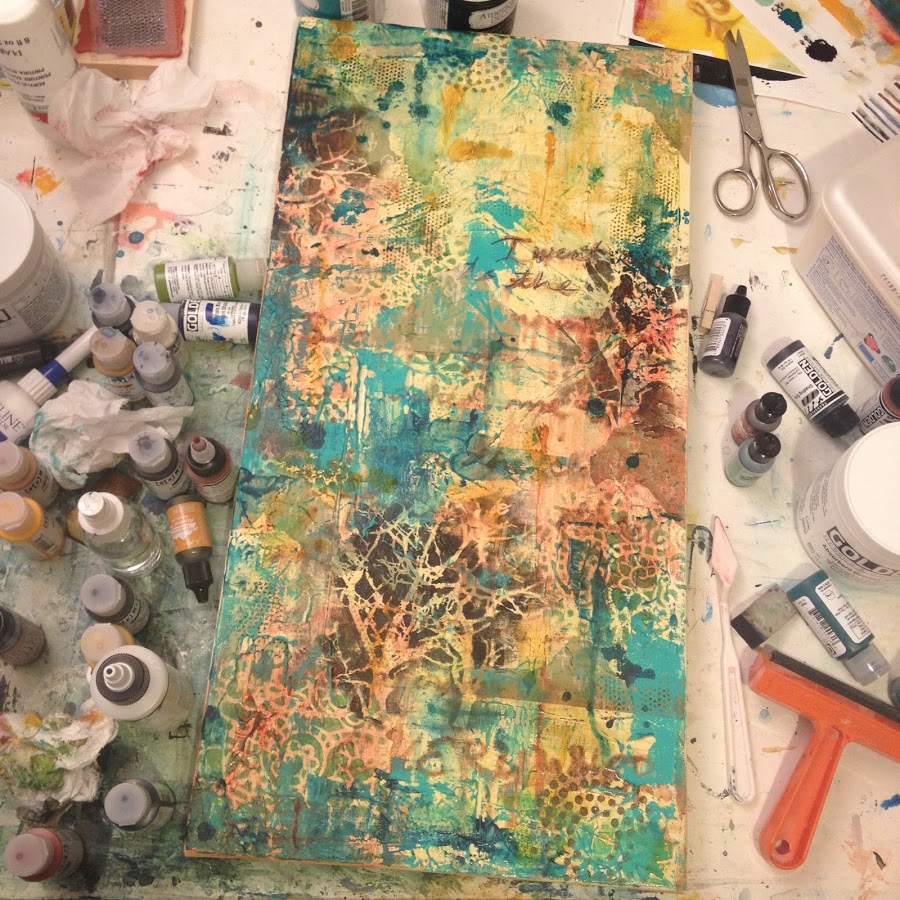
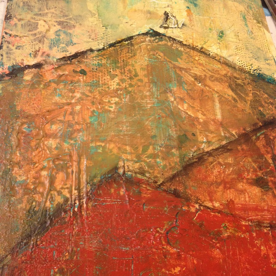
Close up of some layering. I added a layer of acrylic gel medium on top of the first layer and knifed in some texture that you can start to see (It’s more difficult to stencil on top of texture, that’s why I usually stencil first). It dries completely transparent so you can still see your original layers as much as you want. For someone who uses a ton of the stuff, I have found Blick’s version to do the job at a fantastic price. And yes, I buy it by the half gallon. I use the Blick modeling paste a lot too.
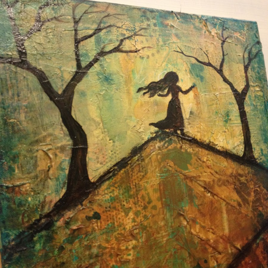
Here I drew in the lines to create the mountain, and did some thin layers of paint in each section. I wanted to have it gradate from deep red to a light yellow at the top of the mountain to symbolize the journey from darkness to light.
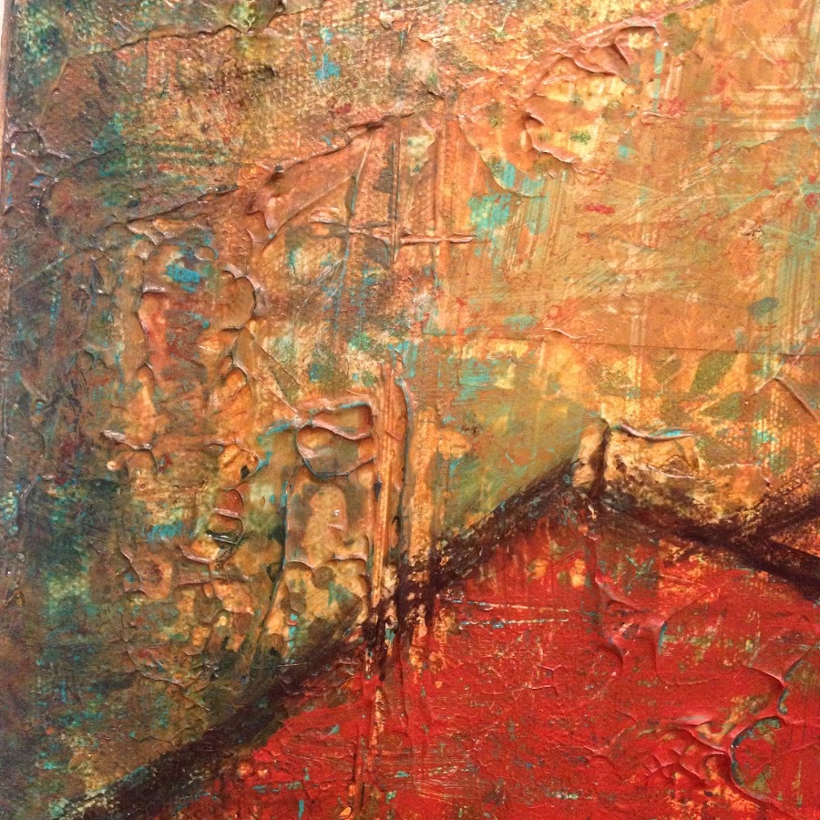
A good technique for getting a distressed look when you paint over layers is immediately after painting, spray the surface with water, wait 30 seconds or so, and then lay a paper towel over the spray and roll your brayer over it. Specks of the bottom layer will show back through while still maintaining the new color you’ve applied. Also, adding acrylic glazing liquid (I use Golden) to any paint will make it more transparent, so you still see some of your previous work showing through.
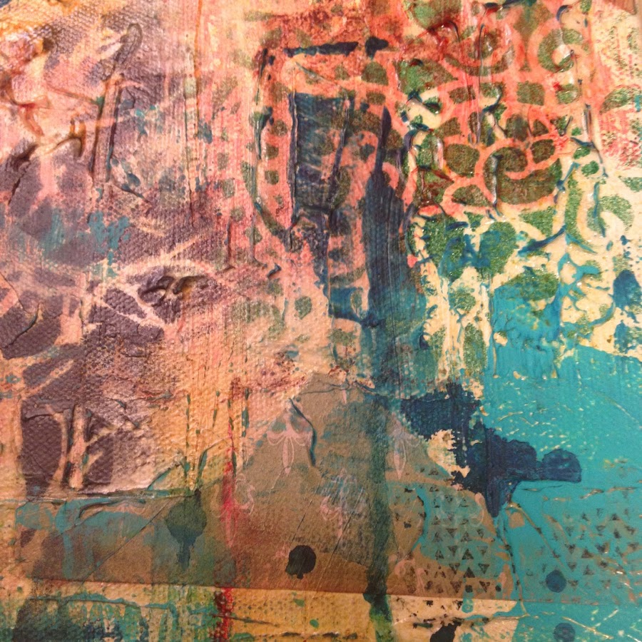
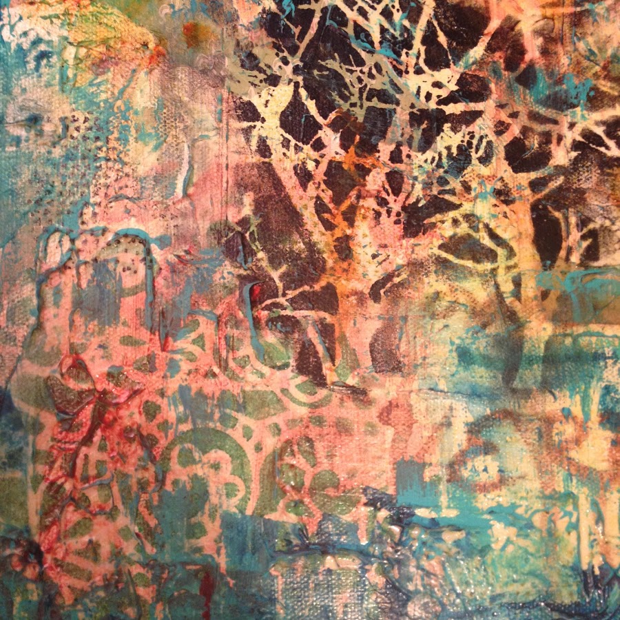
Closeup you can still see quite a bit showing through. I’m in love with the way turquoise looks with deep yellows and reds. Alcohol inks will bleed through a thin layer like this, unlike other kinds of media.
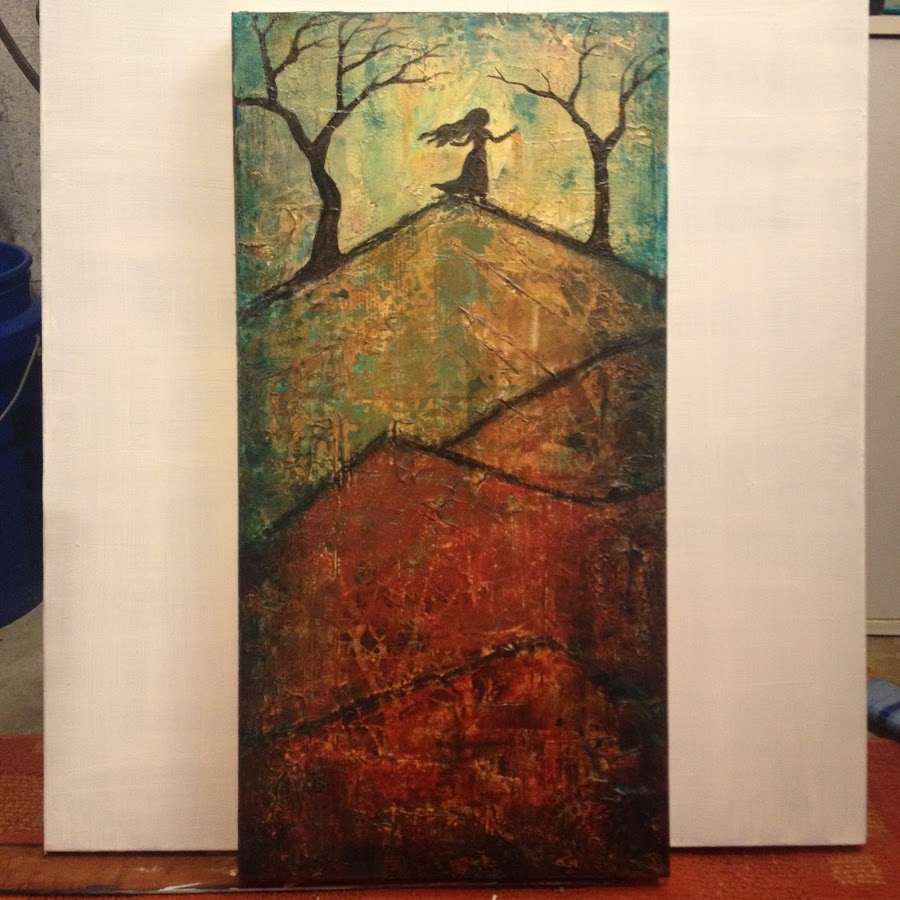
This is what I came up with, deciding to paint a silhouette of a woman/girl and trees at the top of my very stylized mountain. At this point it feels 90% done, but whenever I can I will step away from the painting for several days or weeks and look at it again with fresh eyes to see if finishing touches should be made.
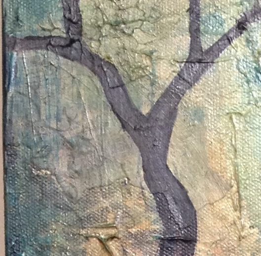
I love the webbing effect the gel medium left, highlighted with the layers I added on top of it.
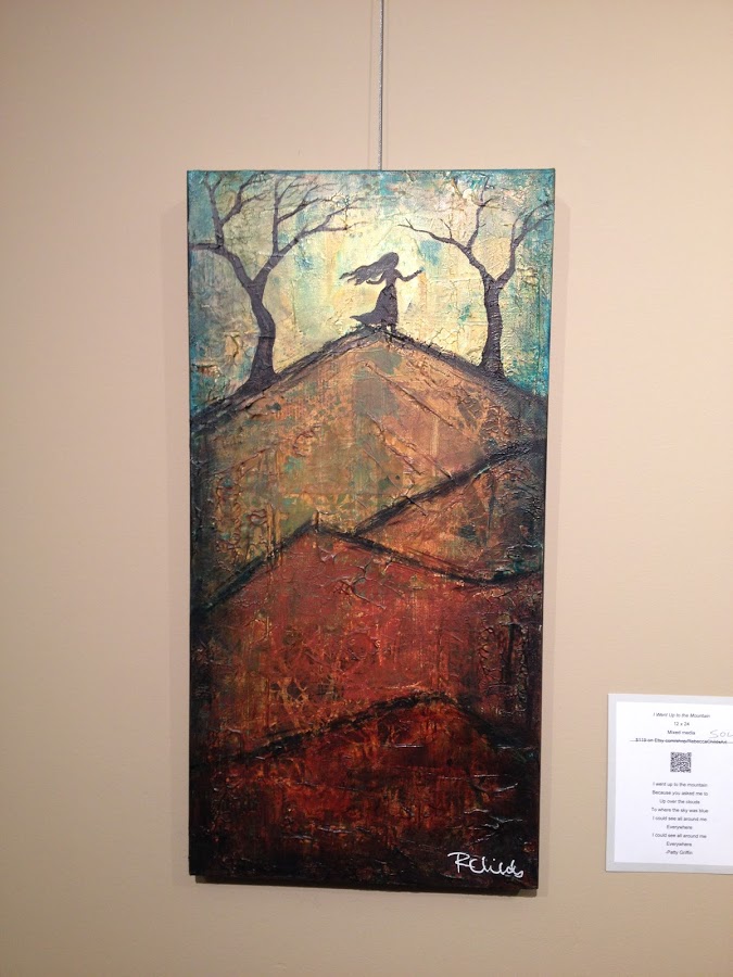
This is the final version hanging in the show. I touched up the figure a little, added more shading around the perimeter, and more subtle writing of the lyrics with a gray Faber Castell Pitt brush pen. I LOVE this set because the light, medium and dark grays let me write over any color and create a subtle effect, and these have no problem whatsoever going over texture–just make sure your paint is dry before you use them.
Close up of the subtle writing I added as a final touch. My intent is for the words to be there, but not necessarily legible. I want the inspiration for the piece to be included but not in a hit-you-over-the head kind of way that distracts from the final image.
This piece is going to someone giving it as a gift to his daughter who did a drama piece for her church making a very similar gesture as the figure in the painting on top of the mountain. I love it so much when someone makes a personal connection like that to my art!